


Today I picked up a new Apple XDR Pro Display, which I probably don’t need.
It’s definitely a large display (or a small TV!) and will mostly be used for overkill things like writing software and web surfing. I think there’s definitely some light falloff and the viewing angles are maybe not as good as the Studio Display, but I really didn’t want to go with two screens (the stereotypical software developer thing) because then the middle of your vision has a big gap where there’s no screen and your head is always pointed weird. The colors are better, but also a bit distracting, as now you’re very aware something you used to think was black is actually not black at all - this includes the theme to your editor, what Discord looks like, the letters that you are typing right now, and so on. Photo Editing? Yes, it’s way better. Things do not look the same at all, everything appears to have texture now that it didn’t use to have.
The obvious test was looking at photos in Lightrom, and I’m happy to see that Lightroom Classic just updated with like FOUR great new features, so this post is mostly about that!
HDR support - which mostly means being able to push whites a lot further, not like to do HDR for bad flickr style sunsets with kittens on them, from the olden days
Point Color - where you can click on a color and pick a new color to remap it to, which doesn’t seem to cause *any* artifacts
An “AI” powered false depth of field feature, which I will resist using, but might come in handy as I’m sucker for depth of field and often just have my iPhone with me
I think some new lens geometry and auto-levelling features, though this may have been in a prior release too
In all, good stuff, here is a some sample picture that was originally from an iPhone taken at Disney World.
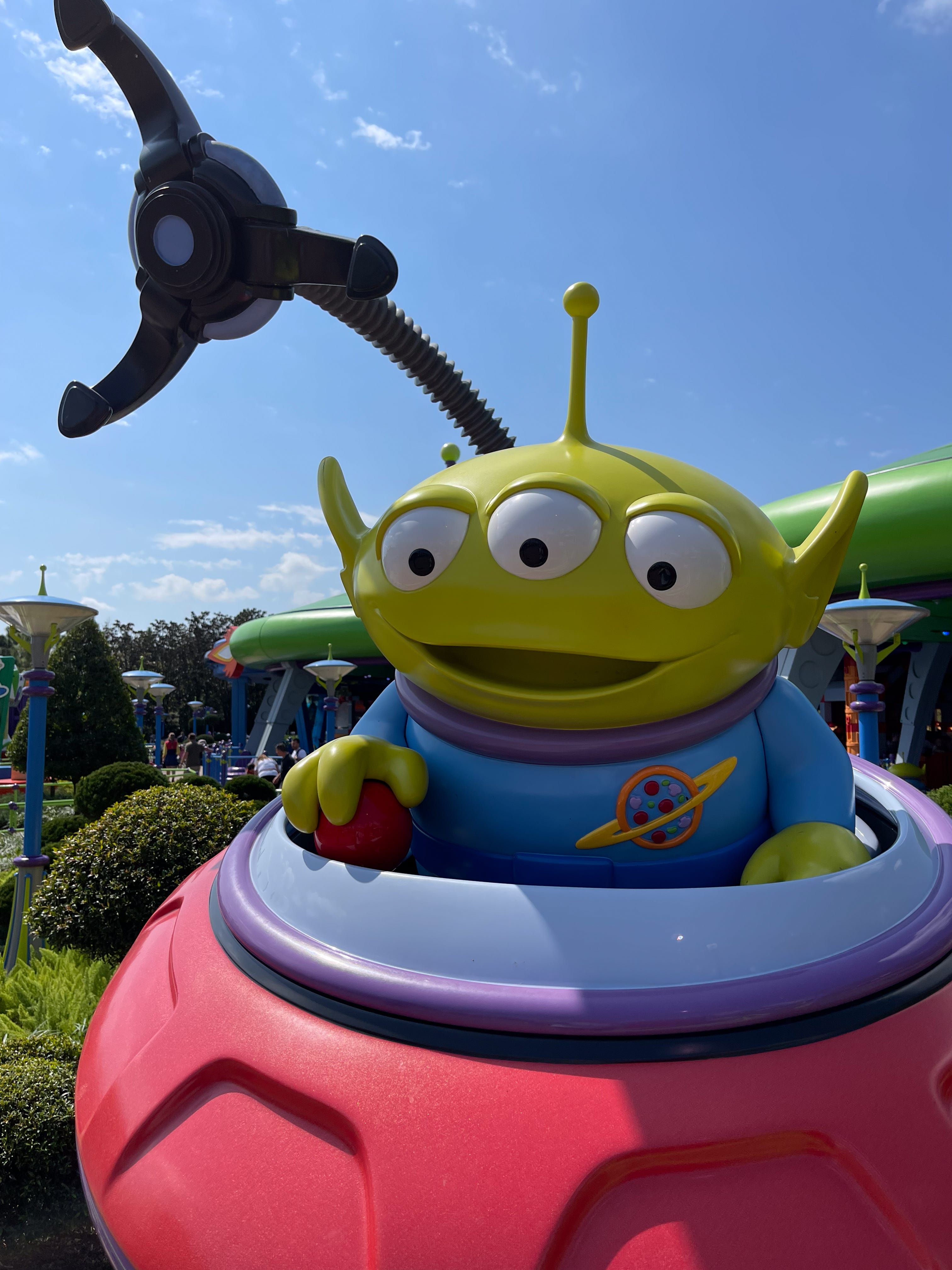
This is an original photo, edited a bit, but without trying out the new features:
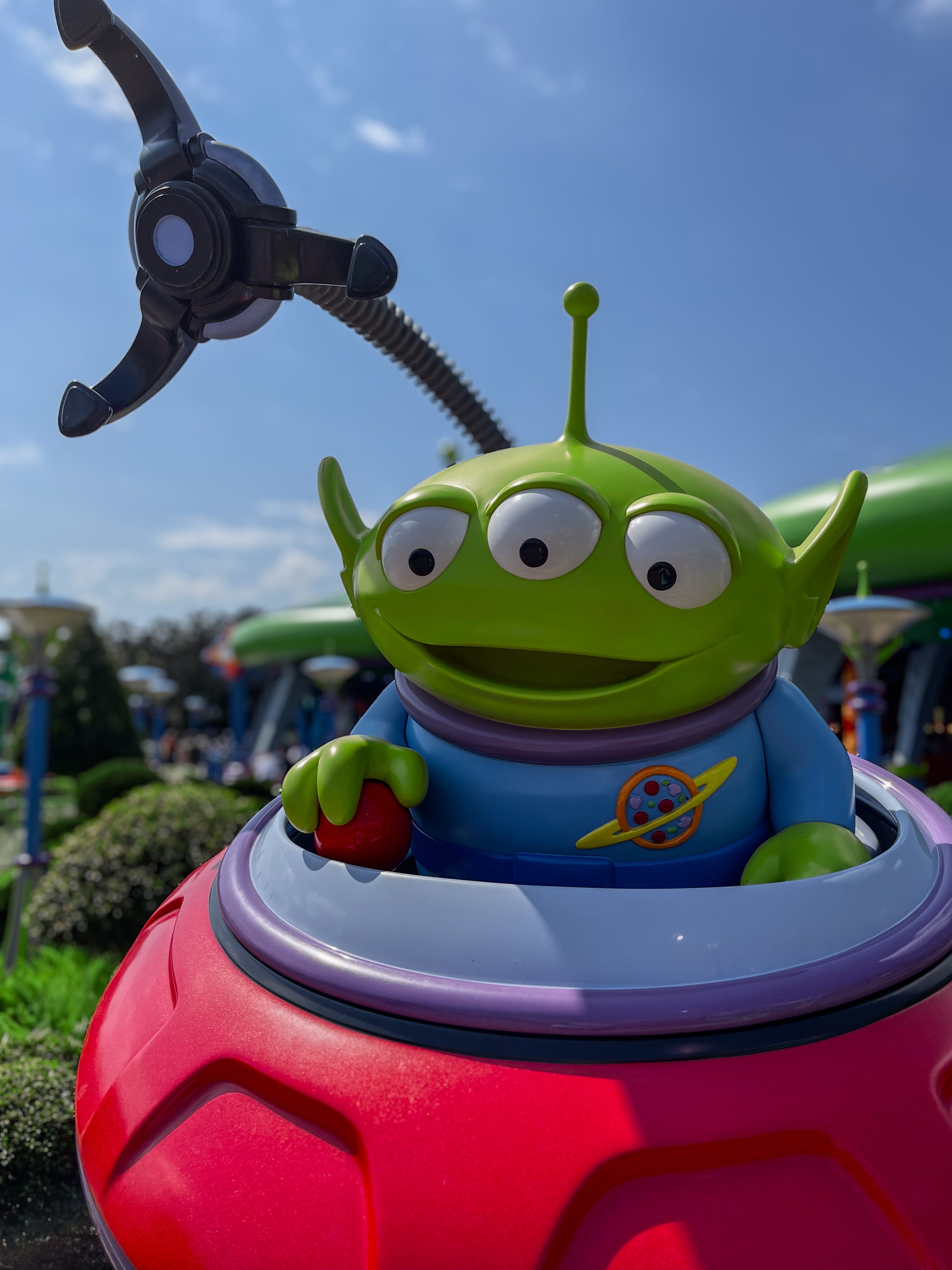
This is with slight point color tweaks to the green (making it slightly less pea green looking), boosting the red, and adding some fake depth of field, also all done in HDR mode. I’m not saying it’s better, but it’s nice to see how easy that was.
And finally this next one is mostly just showing off HDR highlights making Gertie look a bit more shiny and reflective. No original photo this time.
This is a bit hard to appreciate in the small version, but when viewed full size especially on a dark background (especially at high brightness levels) it’s pretty great for 15 seconds of editing and I’d look forward to seeing what large prints look like with the new Lightroom HDR features.

Perhaps not the most amazing stuff to share, photo wise, but I’m happy to see lightroom updated with a bunch of new features this time and if you haven’t checked it out recently, it may be worth an update!
If trying to export HDR, be sure you check HDR in the export dialog, otherwise your extra dynamic range will not show up in exports.